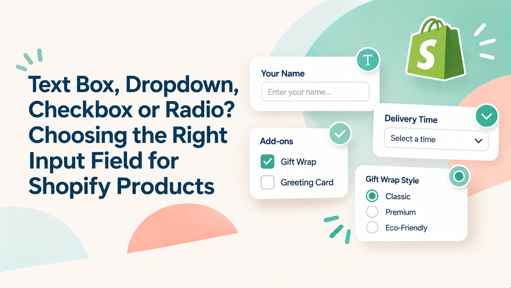
Text Box, Dropdown, Checkbox or Radio? Choosing the Right Input Field for Shopify Products

This guide compares four common Shopify product input fields including text boxes, dropdowns, checkboxes, and radio buttons, so you can choose the right format for personalization, sizing, gift wrapping, add-ons, and delivery preferences.

Arisify Global Team Nov 12, 2026 5 min read
Text Box, Dropdown, Checkbox or Radio? Choosing the Right Input Field for Shopify Products

In this article

  1. 01Different customization requests need different input fields
  2. 02Quick comparison: Which input field should you use?
  3. 031. Text box: When customers need to write something
  4. 042. Dropdown: When customers need to choose one value from a list
  5. 053. Checkbox: When customers can select multiple options
  6. 064. Radio button: When customers must choose exactly one option
  7. 07Text box vs. dropdown vs. checkbox vs. radio: How to decide
  8. 08What does Shopify offer natively?
  9. 09How to choose the right field for add-ons
  10. 10Questions to ask before choosing an input field
  11. 11FAQ
  12. 12Final takeaway

Different customization requests need different input fields

A customer wants to engrave a name on a necklace. Another wants to choose a gift-wrap style. Someone else wants to add a gift box and a greeting card to their order.
These are all product customization requests, but they don't need the same input field.
Choosing the wrong field can make a product page harder to use. A text box is unnecessary when customers only need to select from three predefined choices. A dropdown can hide options that shoppers should be able to compare at a glance. And a checkbox is the wrong choice when customers must select exactly one option.
The right input depends on one simple question: What kind of answer do you need from your customer?
This guide compares four common Shopify product input fields---text boxes, dropdowns, checkboxes, and radio buttons---so you can choose the right format for personalization, sizing, gift wrapping, add-ons, and delivery preferences.

Quick comparison: Which input field should you use?

Input field

Customer action

Best for

Example

Text box

Types an answer

Customer-specific information

Engraving name

Dropdown

Selects from a compact list

Longer lists of predefined choices

Delivery time slot

Checkbox

Selects one or more choices

Optional extras and add-ons

Gift wrap + greeting card

Radio button

Selects one visible choice

A small set of mutually exclusive choices

Gift-wrap style

The simplest rule: use a text box when you need customers to write something, a dropdown when they need to choose one item from a longer list, radio buttons when you want a few choices visible, and checkboxes when they can select multiple items.

1. Text box: When customers need to write something

Aris option type: Single Line Text

A text box gives customers a space to enter their own information instead of choosing from predefined values.
It's useful when the answer is unique to each order and cannot be predicted in advance.
Common examples
  • Engraving a name, initials, or short message.
  • Adding a personalized label to a product.
  • Entering a custom reference or short instruction.
  • Providing a detail that isn't covered by your existing product options.
For longer messages or special instructions, consider a multi-line text field instead of a single-line input. Aris lists Single-line text and Multi-line text as separate input types.

What to configure

In Aris Product Options, the Single Line Text option includes several settings that help control what customers enter:

  • Required field: Make the input mandatory before the customer can proceed.

  • Min/Max characters: Set character limits to prevent entries that are too short or too long.

  • Input type: Choose the accepted input format, such as plain text or numbers.

  • Placeholder and Help Text: Show an example or explain what customers should enter.

  • Conditional logic: Display the text field only when a relevant option is selected.

  • Add-on product: Apply an extra charge when customers enter text, such as for personalization.

For example, a jewelry store could ask customers to enter an engraving message, set a maximum character count, and make the field required only when engraving is selected.
Mobile consideration: Keep the instruction short and specific. A placeholder such as "Enter up to 12 characters" is more useful than a generic "Enter text." Test the field with the mobile keyboard to make sure the input and Add to cart button remain easy to access.

2. Dropdown: When customers need to choose one value from a list

Aris option type: Dropdown Menu

A dropdown lets customers select one value from a predefined list. It is especially useful when you have several choices but want to keep the product page compact.
Common examples
  • Selecting a delivery time slot.
  • Choosing a packaging or gift-wrap type.
  • Selecting a material or finish.
  • Choosing from a list of predefined product configurations.
A dropdown works best when the choices are mutually exclusive and customers don't need to compare every option visually at the same time.

What to configure

Aris's Dropdown Menu option supports:

  • Option values: Add choices individually or in bulk.

  • Default value: Preselect a recommended value.

  • Required field: Require customers to make a selection before adding the product to cart.

  • Min/Max selection: Define how many options can be selected.

  • Placeholder text: Display a prompt such as "Please select a delivery slot."

  • Show price: Display additional prices next to option labels, values, or both.

  • Conditional logic: Show or hide dropdown choices based on other customer selections.

These settings help merchants organize choices while keeping the product page concise.
Mobile consideration: Dropdowns can save vertical space, but customers may need to tap to see the available values. Use clear labels and avoid overly similar choices. If the options are important to compare---for example, three gift-wrap designs---radio buttons may make the differences easier to see.

3. Checkbox: When customers can select multiple options

Aris option type: Checkboxes

Checkboxes allow customers to select more than one value from a list. Use them when choices are independent and can be combined.
Common examples
  • Adding gift wrap and a greeting card.
  • Selecting several optional product accessories.
  • Choosing multiple add-on services.
  • Adding extra features to a customizable product.
For example, a customer buying a gift set might want both premium wrapping and a personalized greeting card. Checkboxes let them select both without forcing them to choose only one.

What to configure

Aris Checkboxes include settings for:

  • Option values: Create individual choices, each with its own label and optional image.

  • Required field: Require at least one checkbox selection.

  • Min/Max selection: Set the minimum or maximum number of choices customers can select.

  • Default value: Preselect one or more choices.

  • Show quantity: Let customers specify a quantity for each selected option, with minimum and maximum limits.

  • One Time Charge: Apply an extra charge once rather than multiplying it by the product quantity.

  • Conditional logic: Display relevant checkbox options based on earlier selections.

You can also configure how additional prices appear next to the option labels or values.
Mobile consideration: Avoid presenting a long list of checkboxes without grouping. Keep option labels short, make the selectable area comfortable to tap, and show additional prices clearly. If there are many choices, consider grouping related add-ons or using conditional logic to display only relevant options.

4. Radio button: When customers must choose exactly one option

Aris option type: Radio Button

Radio buttons are designed for single selection. Unlike checkboxes, customers can select only one value from the group.
They are especially useful when you want all available choices to be visible without requiring customers to open a dropdown.
Common examples
  • Choosing one gift-wrap style.
  • Selecting one packaging option.
  • Choosing a personalization tier.
  • Selecting one delivery or service preference.
For example, a store offering Standard, Premium, and Luxury gift wrapping can display all three choices as radio buttons. Customers can compare the options before selecting one.

What to configure

Aris Radio Button settings include:

  • Option values: Add choices with a text label and optional image.

  • Default value: Preselect a recommended choice.

  • Required field: Require customers to select an option before adding the product to cart.

  • Option Value Column: Arrange options in one, two, three, or four columns.

  • Add description: Provide extra details below an option value.

  • Show price: Display additional prices next to the option label, value, or both.

  • Conditional logic: Show or hide radio button options based on other selections.

Aris also supports quantity settings for individual radio button values, where applicable.
Mobile consideration: Radio buttons make choices visible, but a multi-column layout can become crowded on smaller screens. Test the storefront on a phone and check whether labels, descriptions, and prices remain readable. A single-column layout may be easier to scan when option names are long.

Text box vs. dropdown vs. checkbox vs. radio: How to decide

The four fields can look similar in an option builder, but they collect different kinds of answers.

Question you want to ask

Recommended field

Why

“What name should we engrave?”

Text box

The customer provides a unique answer

“Which delivery slot do you prefer?”

Dropdown

Keeps a predefined list compact

“Which extras would you like?”

Checkbox

Customers can select multiple add-ons

“Which gift-wrap style do you prefer?”

Radio button

One choice, with all options visible

What about product size?

If size is a standard product variation; such as Small, Medium, and Large; Shopify's native variants are usually the right starting point.

If size is a custom measurement or a special request that doesn't represent a purchasable inventory variant, a custom input may be more appropriate. For example, a made-to-measure product could use a number or dimension input rather than a standard variant selector.
The distinction matters because a Shopify variant can have its own price, inventory, and other variant details. A custom product option is primarily used to collect additional customer choices or information.

What does Shopify offer natively?

Shopify already supports product options and variants for products with different versions, such as size, color, or material.
When creating a product, merchants can add option names and values to generate variants. Shopify's current documentation allows up to three options per product and up to 2,048 variants per product, subject to compatibility considerations for some themes, apps, and sales channels.
However, native variants are not the same as custom product inputs. If you want customers to type an engraving message, upload a file, or select several optional add-ons, you may need a third-party product options app or custom theme development. Shopify's own variant documentation notes that custom requirements beyond standard variant options can require a third-party app or theme customization.

Shopify native options vs. Aris custom options

Capability

Shopify native variants

Aris Product Options

Standard size or color choices

Yes

Can be used for additional custom choices

Variant-specific price and inventory

Yes

Add-on pricing and option inventory features are available for supported configurations

Customer-entered text

Not a standard variant value

Single-line and multi-line text

Multiple selectable add-ons

Not a standard variant selection

Checkboxes

One choice from a custom list

Native variant selector

Dropdown or radio button

Conditional display of custom fields

Requires additional customization or compatible tools

Conditional logic

Standard size or color Yes Can be used for choices additional custom choices
Aris also has a Shopify Option tab that lets merchants customize the storefront display of existing Shopify variant options. Its separate Aris Option tab is where merchants create custom options such as text inputs, file uploads, pop-ups, and add-ons.

How to choose the right field for add-ons

If your goal is to increase product customization or offer paid extras, the input field should match how customers combine those extras.

Consider these examples:

  • One paid upgrade: Use a dropdown or radio button if customers must choose one upgrade.

  • Several optional extras: Use checkboxes if customers can select multiple add-ons.

  • Personalized text with an extra fee: Use a text box and configure an add-on charge.

  • A follow-up question: Use conditional logic to show another field only after a relevant choice.

Aris's Add-on Product feature can apply an additional cost based on a customer's selected option value or text input, depending on the field configuration. The One Time Charge setting can also change whether the extra charge is multiplied by the product quantity.

Questions to ask before choosing an input field

  • Does the customer need to type an answer or select from predefined choices?
  • Can they select more than one value?
  • Is the field mandatory, or should it be optional?
  • Does the choice affect the price or require a follow-up question?
  • Can customers complete the field comfortably on mobile?

FAQ

Can I add a checkbox to a Shopify product page?

Yes. Shopify merchants can use a product options app such as Aris Product Options to add checkbox fields for multiple selections, such as gift wrap, greeting cards, or optional accessories.

How do I add a dropdown to a Shopify product page?

You can use Shopify's native variant selector for standard product variations, or use a product options app to create a custom dropdown for additional choices. In Aris, create an Option Set, add a Dropdown Menu option, define its values, and configure settings such as required selection, default value, and placeholder text.

Should I use checkboxes or radio buttons for product add-ons?

Use checkboxes when customers can choose multiple add-ons. Use radio buttons when they must select exactly one option.

Can I charge extra for a selected option?

Aris supports add-on pricing for supported option types. You can configure additional charges for selected values or text input, and use One Time Charge where you want the fee to apply only once regardless of product quantity.

Are Shopify variants the same as custom product options?

No. Shopify variants represent purchasable versions of a product and can have their own price and inventory. Custom product options collect additional information or choices, such as engraving text or gift-wrap preferences.

Final takeaway

The best product input field is the one that matches the answer you need:

  • Text box: Customers need to write something.

  • Dropdown: Customers need to choose one value from a longer list.

  • Checkbox: Customers can select multiple options.

  • Radio button: Customers must choose one visible option.

Start with the customer question, not the visual style of the field. Then configure required settings, validation, pricing, and conditional logic around the way the product is actually sold.

Ready to put this into practice?

Explore the Arisify Global app portfolio or visit the Help Center for detailed setup guides.